Tag Archives: typefaces

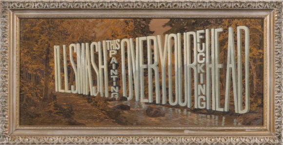
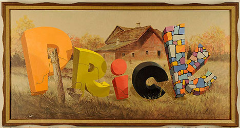
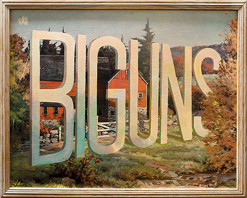
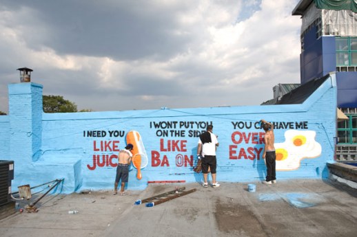
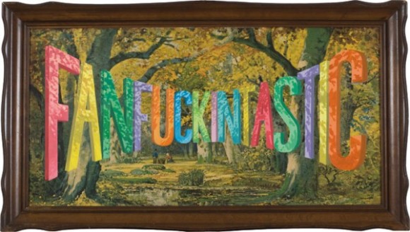
Typeface Tuesdays: Wayne White is Fanfuckingtastic with Type

What do lithographs and funky 3-D type have in common?

Wayne White.

Yes, this artist in the later portion of his career found a way to tactfully combine the two, and the outcome is pretty wild, surreal, and funny at times.

Originally I thought he created the entire piece of art, but then learned that he buys the lithographs from thrift stores and then painstakingly overlays the type with paint. All of his work is impressive, but I do find some of his distorted type to be pretty fascinating and darn incredible (mastering the letterforms and their shadows as they are all turned and twisted is no joke)!

What a nice, colorful way to say what’s really on your mind…
Tagged , , ,

Typeface Tuesdays: Stephen Powers

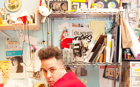
Feel the power of Stephen Powers (aka ESPO). I personally dig this designer for several reasons…

He is a talented type designer.

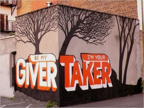
He creates big, colorful street murals with a dash of humor of a big dose of love.

He has unruly Kramer-like hair, and what’s not to love about that?!!

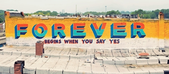
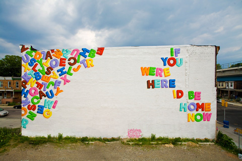
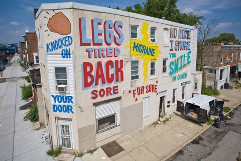
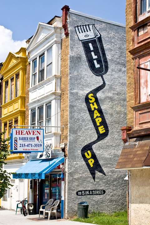
A few years ago, Powers team up with the city of Philadelphia to execute a special project which consisted of dozens of love-themed typographic murals throughout the city. It was appropriately named “Love Letter” and you can check out some of the murals below…

Tagged , , ,

Typeface Tuesday: Functional type

Hi. Wishing you a rad Tuesday. What’s not to love? The weather’s nice and mild, and we only have 3 more days until a 3-day weekend.

So, as some of you may know I got a bike–a white and orange hybrid-style Marin. The color find is totally random but perfect because I look pretty darn good in white modes of transportation…take exhibit A (Miami circa 2004) below.

Anyways, the point of my story is that I’ve gotten really into biking as of late and finally got a new one after what feels like forever BUT is really since I was about 12 years old. At that point I’m sure I had some glittery pink-purple thing and unfortunately it got stolen hence why I am soooo protective of my new wheels.

Enough about me. Let’s talk type. Type that comes in an interesting form and does relate to my anecdote above, I promise. It’s type as a bikerack…or maybe a bikerack as type? Either way, I think this is way amusing and great how the type is functional while also being perfectly readable. What’s extra cool is that it’s located here in DC over by the Dupont Circle Metro stop…so ladies and gents, make sure to lock up your bike on this fancy rack all in the name of typography and non-bike-theft!

See you in the bike lane.

Tagged , , ,

Typeface Tuesdays: Type Connection

Oh do I have a treat for you on this rainy Tuesday!

It’s only two words but a whole lot of type fun — Type Connection.

Basically, this site is a typographic dating game, which means you match typefaces much like you would match two people looking for love. This site is really clever, well constructed site which is clearly founded on a lot of thorough research and typographic expertise. Aura Seltzer, the MICA MFA graphic design graduate who is the brainchild behind this project, knows how to add a dose of humor to make type matching easy and fun. Case in point: Adobe Garamond Pro describes himself as “A modern-day, high renaissance man.”

Hmmm, he might be my type.

Ok, take a peak at the game below… as you can see when you scroll over a type character it changes to green and presents a description. Double click on the character and it takes you another screen where you can choose its match.

Once you’re sick of type matching, or if you just want to get the low down on the best typeface matches from the getgo (aka “you’re tired of being played”), check out the Meet the Matches tab…

Happy playing and remember to keep an open mind when it comes to matching.

And take some time to check out more of Aura’s awesome work, and follow Type Connection at @typeconnection.

Tagged ,

Typeface Tuesdays: Sculptural Type

Haaaaaapppppy Tuesday. Bummed I missed you guys last week but last Tuesday I was completely overcome by events. The good news, however, is I’m baaaaaack because I couldn’t stay away too long. Okay, fine, I’ll stop with the exaggerated A’s.

So I was doing some research and stumbled upon this great looking poster designed by Labour in NYC. What I love about it is how they handcrafted the type and turned it into a sculpture, a true piece of artwork in and of itself. In fact, I think it would make for a beautiful mobile, and reminds me a little of Joan Miro’s work…which for you DC peeps, he is currently showing at the National Gallery. Check it out.

I’ve only spent a mere 15 minutes checking out Labour’s work and I already love them. Stop everything you’re doing right now to check out their site or give them some love on Twitter (@LabourNY).

Tagged , , ,

Typeface Tuesdays: Typographic Maps

Hello. Is it summer yet? This weather is freaking killing me. 57 degrees? Grrrr

Let’s brighten our day and get our type talk on. Oh yeah.

Over the weekend, I was introduced to a wonderful, type-based take on the DC map. I hadn’t seen anything quite like it before. But you better like Helvetica (or at least not detest it) because it’s more than a healthy dose of this acclaimed typeface.

When I did some further research on typographic maps I discovered there are actually a slew of variations, and among them I reallyyy love this one….

Oh, and until next time…enjoy this blingin’ URL (yes, I’m easily amused)http://graphics8.nytimes.com/images/blogs/tmagazine/images/NYT-Confetti2.gif

Tagged , , ,

Typeface Tuesdays: Mad Men Era Type

Okay, I know I know I’m a little late on this one…

I’m feeling the Mad Men vibe these days. Among the intriguing storyline I can’t get enough of that hottie pottie, Don Draper. Break me off a piece of that.

So in honor of the series, I am going to take you back to the advertising age of the 1960s and walk through, at a super high level mind you, how type was used back than compared to today. Taking a look at print ads only, there are some interesting distinctions. My overall take is that there were a lot less design rules back then when it came to type. (Also note: there are obviously a lot of other differences with these ads, particularly the tone of the message itself)

  • There was a tendency to incorporate much more copy I guess because the notion was the product required more of description to sell it
  • There weren’t as many rules around how many and what kind of typefaces could be combined (take a peak at the Maybelline ad below)
  • The justification and leading does not appear to have as much consistency or flow, and in general the spacing feels tighter around graphics and there is less of an appreciation for white space

VOLKSWAGEN

MAYBELLINE

CIGARETTES

Tagged , , ,

Typeface Tuesdays: Combining type

Something that always puts me in a good mood is a cup of tea. Earl Grey. Mint. Green. You name it (except the kind that helps with “cleansing”…I stay away from that!)

Yesterday, I stumbled upon a brand of tea I had never heard of before–Paromi tea. Now this tea doesn’t only taste authenically good, but also looks great. This isn’t your granny’s favorite Twinings (which I’ve been bred to love but have drifted from)…this is a burst of flavor and color, and some healthy antioxidants to boot.

The packaging, right down to the tea bag itself, is unlike anything I’ve seen out there for this kind of product. One element that really stood out to me was the type…the designer did a really nice job of combining multiple fonts across categories. There is a very distinctive script and sans serif in the branding, and then the rest of the packaging showcases a serif and another script-y font. Technically speaking, if we were to follow “the rules” this is really too many fonts, but rules can be boringggg and I must say here it works as it was done thoughtfully and with good craftsmanship. Besides that, I enjoy the color coding that was implemented across the package where each container/flavor has a unique palette. One thing, for the sake of design, is I wish they had the little tea string and label, but from a practically and economical standpoint it’s not really necessary…I like my tea bag to sit in the cup the whole time I drink it anyway, don’t want to waste one bit of flavor!

Bottoms up.

Tagged , ,

Typeface Tuesdays: Barbara Kruger

A week ago I stumbled upon the work of Barbara Kruger, the American conceptual artist, at the National Portrait Gallery as I was strolling through after work…

I immediately liked it. You see, I’ve always had a thing for artwork that is made up by multiple pieces, which tells a different story depending on the arrangement or if you deduct/add pieces. Beyond that I love how its dynamic and vibrant, and the way she incorporates type with the images is simply brilliant. It’s a little hard to see but the message here (with text on each picture) is “We will no longer be seen and no heard.” When Kruger refers to “we” she means women and anyone else who struggles to have power in society during the 1940s/50s. She is not to afraid to say what’s on her mind and raise a taboo topic, which I appreciate.

I did a little more research and was blown away by the career Kruger built focused around the use of type and beyond that her poignant and meaningful messaging. This lady had a powerful way with words.

For instance, check out this Helvetica wrap job she did on the Lever Building on New York City’s Park Ave. Go to this article to see more extraordinary images of this building’s text-y interior. (Yes, that way intended).

I like a lot of her work, including some of the following pieces…

Hilarious…this one has the tone of someecards.com…clearly ahead of her time


Tagged , ,

Typeface Tuesday: NYC Love

Who doesn’t love NYC? …Or at least some aspect of it because it really is all things to all people. If you even remotely love the urban scene, you can’t deny this city is amazing. During a speechwriting class I took in college, I gave a speech dedicated to my love for the “big apple” and much of what I explained loving was the endless access to anything and everything…including art. And, you don’t even have to go into a museum to enjoy it.

The Love sculpture by American artist, Robert Indian, started as a Christmas card design for the MOMA in the 1960s. Sometime after that it became…I’m pretty sure world-famous, and though it’s found on the streets of cities other than NYC it started there and will always be a part of this city. What’s interesting about the sculpture’s design is that it is so simply yet so impacful…a slabserif saturated in color and a titled letter “O”…which so beautifully compliments this simple yet impact message of love.

xoxo

Tagged , ,