Category Archives: Designer Moment

Hello twenty thirteen

I’m baaack. This past Christmas break felt more deserved than ever before. My first semester at MICA revealed a daunting reality to me: making art is hard. And, the practice of art making takes so much time and repetition to get it just right…but even then it’s always subject to change because it’s art and it’s never really done. But now that I’m over the hump of my initial exposure to art school, I want to make sure I keep up with my blog. I love writing and sharing my observations, inspirations, and opinions with others…and there’s so much to share while you’re immersed in an academic environment.

One of my “designer moments” during the fall semester was when I was able to pinpoint the particular aesthetic style of my work. I like designs that are very graphic and colorful that are rich in typographic form. This style is reflected in much of the Dutch design work of the late twentieth century through today. Thanks to my new Meggs’ History of Graphic Design book, I’ve enjoyed learning about the Dutch culture and history and the ways in which it has influenced their overall approach to design. I can particularly relate to this line from the book: “Dutch citizens prize their individuality and free expression and extend this freedom to others, creating a social climate that encourages innovation.” An example of this approach is Studio Dumbar, a rad little brand identity design company based in Rotterdam in South Holland, as well as in Shanghai, China and Seoul, Korea. Founded by Gert Dumbar who got his training from London’s Royal College of Art, Studio Dumbar prizes itself on encouraging individual expression and diverse techniques. It’s a culture that fosters intuition and humor. By the 1980s, many other designers were mimicking the studio’s design style.

Below is a taste of what they make…

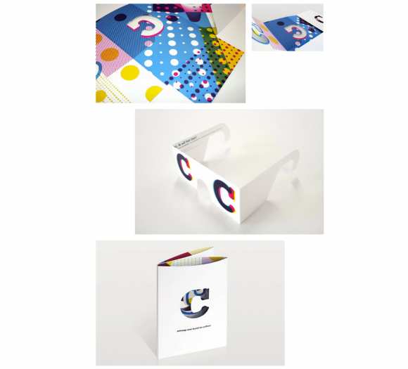
This is an integrated branding campaign for C Broadcasting in which Studio Dumbar devised a system of dots and the letter ‘C’ as a brand identity. I really enjoy that the ‘C’ can appear in different variations of the CMYK color palette and dotted texture and still appear as one recognizable brand system. Truly clever, and I want a pair of those glasses!

Studio Dumbar C Broadcasting

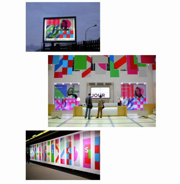
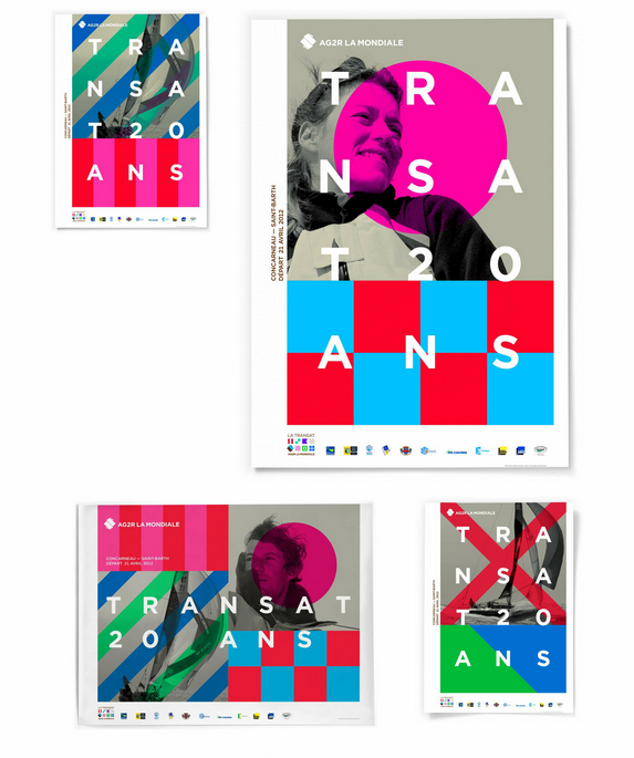
This campaign is especially interesting because you’d never guess what it’s for. It’s a new brand for a French insurance company merger. Wild, right?! I love it because the simple application of geometric shapes creates such an interesting pattern. It feels so fresh and exciting. They did a great job applying the design to many communications platforms…visit the website to see the full campaign and learn more.

Studio Dumbar AG2R LA MONDIALE LE TRANSAT

Studio Dumbar AG2R LA MONDIALE LE TRANSAT 2

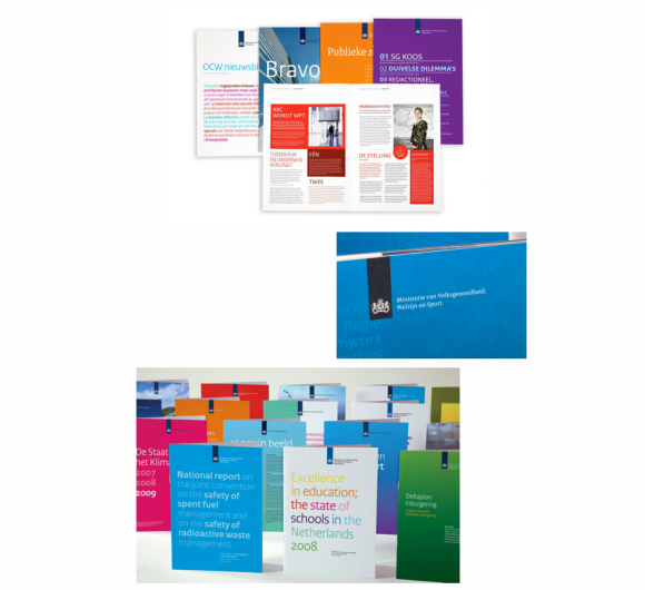
Lastly, I wanted to share some of Studio Dumbar’s work for the government because their designs for the Dutch postal service (former called the Royal Dutch PPT and now TPGPOST) influenced the beginning of a widespread shift in more expressive design in the public space. I couldn’t find the actual TPGPOST designs but below are comparable designs for the Dutch Government, which you can explore more here.
Studio Dumbar Dutch Government

Designer Moment: Providing the Client with the Best Solution

Stellar week of design. I really stretched myself and built a lot of confidence. While working on the aforementioned process graphic with Shawn I learned another invaluable lesson…

I submitted the concepts to the client. The client chose the one she liked but thought the yellow and beige were too matchy. When a client has an issue with any aspect of the design, its up to you as the designer to help them arrive to the best solution. With any problem at hand there is generally more than one answer. My first instinct was to go for the first color combination under solutions where I added the red color, but Shawn showed me that we could also introduce a darker version of the yellow and change the color order (what’s nice about this is that it maintains a similar vibe as the original color palette). I actually like both color variations for different reasons, but think the second is a little more lively. I submitted my recommendations and now it’s up to the client!

ORIGINAL COLORS

COLOR SOLUTIONS

I’m not at liberty to share the full designs, but if I can at a later point I surely will. They came out great.

Off to play in Austin! Check you guys later.

Designer Moment: Finding your inspiration

This past week, I had an AH-HA moment. My “discovery” was actually pretty obvious, but it was the first time I felt like it really clicked for me.

In an effort to take on projects for my portfolio and to gain experience, I started networking at work. I reached out to a few of my go-to graphic designers and told them I was looking for design opportunities. Two days later I had an e-mail in my inbox asking if I had time to work on a process graphic for some senior staff at the firm presenting at the Out and Equal Conference. OH BOY!

I started working with this very talented designer, Shawn, who graduated from the Corcoran. He is playing Art Director and I am the designer. Shawn recommended I go through each and every step of the design process, so I started by thinking/researching (really this is one step to me). I always try to sketch at the phase, as well.

Somewhere along the way while I did research online, I made the CONNECTION. Design conceptualization is not about the skies parting and the BIG IDEA idea magically landing on your lap (although I know some designers who disagree but they’re a rare breed). What I have learned is that it’s about creating a catalog of design ideas in your mind that you build through your entire design career. So as you are presented with design challenges with each new project/client, you reference your design catalog while also adding to it through research — unless you’re lucky enough to immediately come to your idea. Now that I understand it better I am able to look at other designer’s work and now better get how they connected the dots in their designing.

This was a CLUTCH designer moment for me because I’ve found coming up with good ideas to be quite tricky! This is a major step in the right direction and I feel truly empowered.

More to come on my process graphic adventure…going to save the details for a later post.

Tagged ,

Finding my design hero

THANKGODITSFRIDAY. Mmmm, so nice to start my weekend with a glass of wine, good convo, and groovin’ tunes (Bag Raiders, Metronomy, Tune Yards, and the like) with my college bestie visiting from Miami. I paused all of this goodness so I could do a quick post…. that’s how dedicated I am. At times.

I’ve been thinking about this topic — finding my design hero — since my professor brought it up a week ago. He started class last Saturday with a lecture about the importance of having a hero (or more) who can inspire us as designer so as to find our nitch and master our craft. Although I am still not entirely sure what this really means to me, I really took it took heart, and am inspired to find out. This whole past week I have really uped the ante with my designing, and during the process am trying to zero in on my hero. I think, like I am with mentors, I like to dabble here and there for my needs. Lately, I’ve been going to blogs and pulling out my old Communications Art magazines to look at good design work across the board for inspiration. Sometimes, I get lots of inspiration by visiting museums and talking to other designers. It really all depends.

I know this much…my heros are those designs who confidently break the rules. They mess around with typography like Paula Scher. They are those who like to incorporate their hand, like Carolyn Sewell. They are really passionate like Jessica Hische.

This is definitely a topic I’ll continue to explore and address…

In closing, I found this cracked out wonder woman painting at the coffee shop (Baked & Wired) across the street from school, and although it’s a tad startling (lay off the crack lady) I think an appropriate image. Plus I love the random cupcake floating around behind here, ha….

Cheers to a wonderful weekend, all.

Oy vey, the pains that come along with being a graphic designer

Am I just getting older (well, yes, but hey I’m still in my 20s)…or am I experiencing the inevitable pains of being a graphic designer in the 21st century?

Never in my life has my body ached like this before. My back and bum are sore to the point where its painful to sit after awhile, and my hands feel cramped and sometimes numb and tingly. This is what you experience after hours upon hours sitting at a desk behind a computer. And these days so much more is done on the computer considering all the social media tools available.

This reminds me… at one point in highschool I hurt my tail bone and had to use a butt pillow. I became the “butt” of many jokes at school and quickly decided I rather suck it up as opposed to be made fun of. These days, I don’t give a damn. I already know I’m pretty darn fabulous and that I can rock most accessories well. So I think I might have to find myself another butt cushion, something more fashionable. So I started to do some research and there’s not much out there, but I did find this…which is also suppose to make your butt firmer! Have I just fallen victim to the ploys of infomercials?

As for the back pain, I need to do lots of stretching, and occasional yoga. I’m think it might be a nice opportunity to start doing Pilates to make my core stronger. Having a strong core is essential to good posture (which I need to work on) and less pain. As for my hand pain, ya know they joke about designers saving up money for carpal tunnel surgery. Oh gosh. Again its important to stretch and take lot of breaks. This is also good for staying sane because after hours of staring at a computer screen you can start to get a little nutty, I know I do. This is also why I like to print out my designs every few hours so I can see what it actually looks like, and it helps me catch any glaring errors I might not otherwise see on the screen while also giving your eyes a break.

I am reminding myself as much as anyone else to be cognizant of these healthy tips.

(Side note… since there’s not much out there marketed to graphic designer, this might be a chance for me to put on my entrepreneurial hat and come up with something targeting those in the field. I can’t say anymore as I don’t want to reveal any big ideas.)