Category Archives: Typeface Tuesdays

Typeface Tuesdays: Dear Jessica

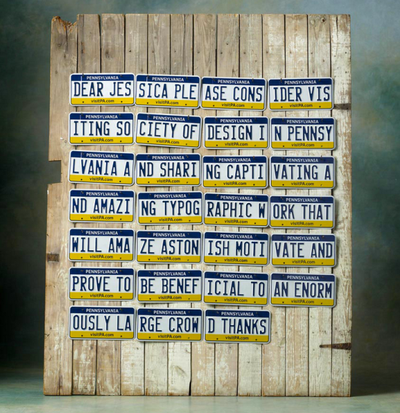
The Society of Design went to great lengths to invite the lovely Jessica Hische to speak at their facility this spring. It consists of 27 registered Pennsylvania license plates assembled together to reveal a message and publicly released on InvitingHische.com. I’m not sure what the significance of license plates other than their permanence. The society wanted to show Jessica they were seriously committed…and like driving? Interestingly because of the medium chosen, the gestalt of this piece has a very different meaning than the individual parts. Without every single license plate gathered together this piece of artwork would not have a clear message and complete feel.

Society of Design - Dear Jessica

You, too, can see Jessica speak at the Society of Design. Check out more information here.
 

Typeface Tuesdays: Anticipating spring

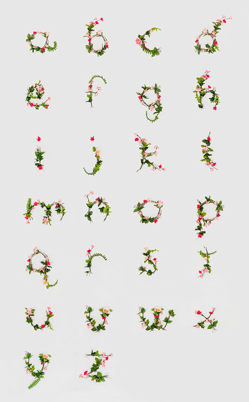
Welcome to the first Typeface Tuesdays post of the new year. Due to my anticipation of spring (and much warmer days) and in honor of the first day of the spring semester at MICA, I am featuring a floral type design by a undergraduate classmate, Anne Lee. These letters are pretty and uplifting.

Floral type by Anne Lee

To see more of Anne’s work, visit her site. In the meantime, buddle up!

Tagged ,

Typeface Tuesdays: Handmade Type

I love this! How creative and thoughtful.

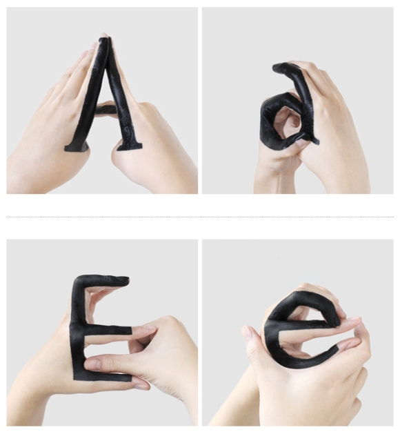
It’s a typography experiment by a designer in New York City named  . She took it up herself to play around with the relationship, more specifically the transition, between uppercase and lowercase letters by painting her hands with black ink and changing her gestures to make the letterforms. It’s a fun and interesting way to study different elements of the letterforms.

Here’s a glimpse at what she’s created.

I definitely recommend you go to Tien-Min’s website to see the project in its entirety, including a video where the letterforms come to life.

Tagged ,

Typeface Tuesdays: Wayne White is Fanfuckingtastic with Type

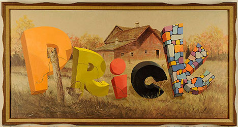
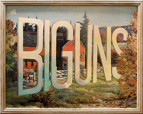
What do lithographs and funky 3-D type have in common?

Wayne White.

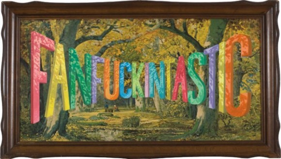
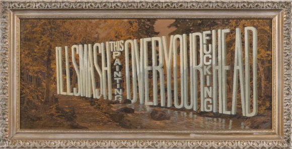
Yes, this artist in the later portion of his career found a way to tactfully combine the two, and the outcome is pretty wild, surreal, and funny at times.

Originally I thought he created the entire piece of art, but then learned that he buys the lithographs from thrift stores and then painstakingly overlays the type with paint. All of his work is impressive, but I do find some of his distorted type to be pretty fascinating and darn incredible (mastering the letterforms and their shadows as they are all turned and twisted is no joke)!

What a nice, colorful way to say what’s really on your mind…

Tagged , , ,

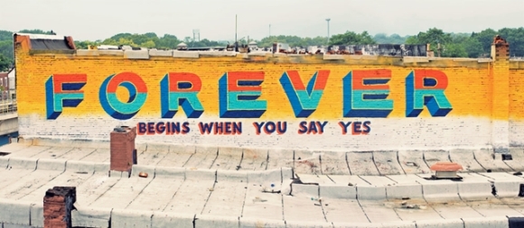
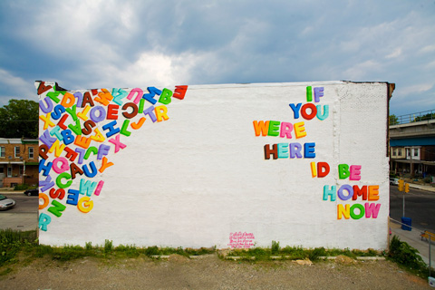
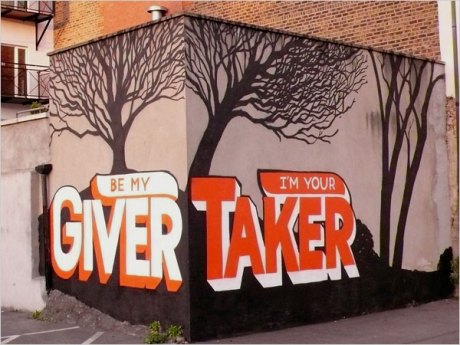
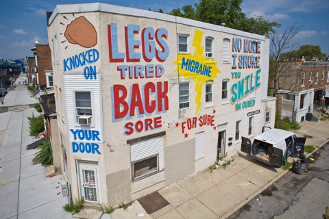
Typeface Tuesdays: Stephen Powers

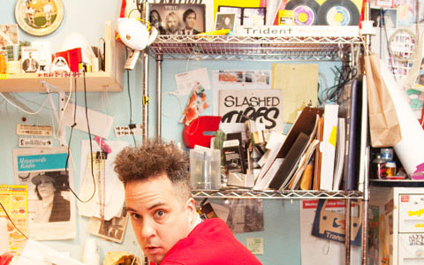
Feel the power of Stephen Powers (aka ESPO). I personally dig this designer for several reasons…

He is a talented type designer.

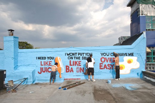
He creates big, colorful street murals with a dash of humor of a big dose of love.

He has unruly Kramer-like hair, and what’s not to love about that?!!

A few years ago, Powers team up with the city of Philadelphia to execute a special project which consisted of dozens of love-themed typographic murals throughout the city. It was appropriately named “Love Letter” and you can check out some of the murals below…

Tagged , , ,

Typeface Tuesday: Functional type

Hi. Wishing you a rad Tuesday. What’s not to love? The weather’s nice and mild, and we only have 3 more days until a 3-day weekend.

So, as some of you may know I got a bike–a white and orange hybrid-style Marin. The color find is totally random but perfect because I look pretty darn good in white modes of transportation…take exhibit A (Miami circa 2004) below.

Anyways, the point of my story is that I’ve gotten really into biking as of late and finally got a new one after what feels like forever BUT is really since I was about 12 years old. At that point I’m sure I had some glittery pink-purple thing and unfortunately it got stolen hence why I am soooo protective of my new wheels.

Enough about me. Let’s talk type. Type that comes in an interesting form and does relate to my anecdote above, I promise. It’s type as a bikerack…or maybe a bikerack as type? Either way, I think this is way amusing and great how the type is functional while also being perfectly readable. What’s extra cool is that it’s located here in DC over by the Dupont Circle Metro stop…so ladies and gents, make sure to lock up your bike on this fancy rack all in the name of typography and non-bike-theft!

See you in the bike lane.

Tagged , , ,

Typeface Tuesdays: Type Connection

Oh do I have a treat for you on this rainy Tuesday!

It’s only two words but a whole lot of type fun — Type Connection.

Basically, this site is a typographic dating game, which means you match typefaces much like you would match two people looking for love. This site is really clever, well constructed site which is clearly founded on a lot of thorough research and typographic expertise. Aura Seltzer, the MICA MFA graphic design graduate who is the brainchild behind this project, knows how to add a dose of humor to make type matching easy and fun. Case in point: Adobe Garamond Pro describes himself as “A modern-day, high renaissance man.”

Hmmm, he might be my type.

Ok, take a peak at the game below… as you can see when you scroll over a type character it changes to green and presents a description. Double click on the character and it takes you another screen where you can choose its match.

Once you’re sick of type matching, or if you just want to get the low down on the best typeface matches from the getgo (aka “you’re tired of being played”), check out the Meet the Matches tab…

Happy playing and remember to keep an open mind when it comes to matching.

And take some time to check out more of Aura’s awesome work, and follow Type Connection at @typeconnection.

Tagged ,

Typeface Tuesdays: Sculptural Type

Haaaaaapppppy Tuesday. Bummed I missed you guys last week but last Tuesday I was completely overcome by events. The good news, however, is I’m baaaaaack because I couldn’t stay away too long. Okay, fine, I’ll stop with the exaggerated A’s.

So I was doing some research and stumbled upon this great looking poster designed by Labour in NYC. What I love about it is how they handcrafted the type and turned it into a sculpture, a true piece of artwork in and of itself. In fact, I think it would make for a beautiful mobile, and reminds me a little of Joan Miro’s work…which for you DC peeps, he is currently showing at the National Gallery. Check it out.

I’ve only spent a mere 15 minutes checking out Labour’s work and I already love them. Stop everything you’re doing right now to check out their site or give them some love on Twitter (@LabourNY).

Tagged , , ,

Typeface Tuesdays: Typographic Maps

Hello. Is it summer yet? This weather is freaking killing me. 57 degrees? Grrrr

Let’s brighten our day and get our type talk on. Oh yeah.

Over the weekend, I was introduced to a wonderful, type-based take on the DC map. I hadn’t seen anything quite like it before. But you better like Helvetica (or at least not detest it) because it’s more than a healthy dose of this acclaimed typeface.

When I did some further research on typographic maps I discovered there are actually a slew of variations, and among them I reallyyy love this one….

Oh, and until next time…enjoy this blingin’ URL (yes, I’m easily amused)http://graphics8.nytimes.com/images/blogs/tmagazine/images/NYT-Confetti2.gif

Tagged , , ,

Typeface Tuesdays: Mad Men Era Type

Okay, I know I know I’m a little late on this one…

I’m feeling the Mad Men vibe these days. Among the intriguing storyline I can’t get enough of that hottie pottie, Don Draper. Break me off a piece of that.

So in honor of the series, I am going to take you back to the advertising age of the 1960s and walk through, at a super high level mind you, how type was used back than compared to today. Taking a look at print ads only, there are some interesting distinctions. My overall take is that there were a lot less design rules back then when it came to type. (Also note: there are obviously a lot of other differences with these ads, particularly the tone of the message itself)

  • There was a tendency to incorporate much more copy I guess because the notion was the product required more of description to sell it
  • There weren’t as many rules around how many and what kind of typefaces could be combined (take a peak at the Maybelline ad below)
  • The justification and leading does not appear to have as much consistency or flow, and in general the spacing feels tighter around graphics and there is less of an appreciation for white space

VOLKSWAGEN

MAYBELLINE

CIGARETTES

Tagged , , ,