Tag Archives: typeface

Typeface Tuesdays: Handmade Type

I love this! How creative and thoughtful.

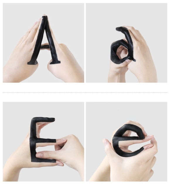
It’s a typography experiment by a designer in New York City named  . She took it up herself to play around with the relationship, more specifically the transition, between uppercase and lowercase letters by painting her hands with black ink and changing her gestures to make the letterforms. It’s a fun and interesting way to study different elements of the letterforms.

Here’s a glimpse at what she’s created.

I definitely recommend you go to Tien-Min’s website to see the project in its entirety, including a video where the letterforms come to life.

Tagged ,

Typeface Tuesdays: Don’t Dream It, Be It

Ah, I was too tired last night to post…I think I am still getting use to the losing an hour with the daylight savings thingy.

ANYHOO…my good friend is performing in the Gay Men’s Chorus of Washington’s upcoming rendition of the Rocky Horror Show. This week there was an e-mail floating around among our friends about going to see it, and besides wanting to go when I saw the advertisement I was like “Oooo, nice use of type.” Ha, totally nerding out on type at any chance I get.

As for the design, it’s slightly weird that he’s missing his legs completely and the calves look a little like they’re floating, but I think it works for the most part and I love the large ‘B’ for the butt. If one were to use a ‘B’ to represent my booty it would be a super-duper bold with no condense, that’s for sure!

And, remember…don’t dream it, be it.

Tagged ,

Typeface Tuesday: Good Work Takes Hard Work

Hey kiddos. This poster by Brent Couchman is rad!

It’s a nifty compilation of lines and shapes to make up a clever and interesting typeface. And, the message itself is on point. Just as this design took hard work I’m sure, so do all things in life that are most rewarding. So enjoy this work of art and remember to WORK HARD at those jobs, relationships, projects, adventures, and endeavors that mean the mean the most to you and the direction your life is taking.

And, but of course, PLAY HARD. Life is long but in the end too short.

Tagged , ,

Typeface Tuesdays: Matteo of Mucca NYC

I was overcome by events yesterday, and wasn’t able to get this post out…

I never knew design could be so funny. That was until I encountered Matteo Bologna–graphic artist, typeface designer (mostly display faces), and owner of Mucca, a branding and design firm in New York–at last Thursday’s AIGADC event with my design buddy, Annie.

With his thick Italian accent and un-ironic moustache, he took us on a journey of how he took the design field by storm as a foreign-national over a decade ago. It was really funny to hear him talk about how he had shed his male Italian mindset towards advertising (e.g. using the female body to sell). Besides being hilarious, it quickly became evident that Matteo and his team are very talented and have influenced a lot well-known brands I was already well familiar with.

“I have a morbid passion for type that no one cares about like I do.”

Balthazzar: Developed the logo and menu design before the restaurant even opened, helping making Balthazzar’s reputation what it is today

Sant Ambroeus Restaurant: Developed the new identity for this 1930s restaurant, by updating the “weird” type, creating a secondary typeface, and adding a religious look and feel

BrooklynFare: Developed the brand identity for this local Brooklyn-based grocery store, and of course humor was involved…check out this video ad…http://vimeo.com/5187993

And last but certainly not least… I will end with my favorite…

Schiller’s Liquor Bar: Developed an identity that was supposed to look “undesigned” which was applied to the bar front, menus (inspired by hole-in-the-wall Italian joints where the chef would handwrite the menu), and even the wine bottles.

According to Mr. Mucca, the trick to designing a typeface like this is to create 3 variations for each letter because then it actually appears handwritten. He used Opentype to create it.

Tagged , , ,

Typeface Tuesdays: Helvetica

This morning I read a spot-on article called “How Helvetica Conquered The World With Its Cool, Comforting Logic” by Co.Design. The article makes a good point that whether you like Helvetica or not, you have to live with it because it has become such a fixture in our society that it’s practically everywhere…your computer, your cereal box, your friend’s t-shirt, your work brief, you name it.

What’s interesting about this Swiss-made font, is that people are generally pretty divided on how they feel about it. I see both sides because I am a reformed anti-Helvetica designer. At first, I was put off because it seemed so ordinary and somehow obvious like other certain san serifs (this was clearly naive of me at the time), and it drove me crazy how it had become so mainstream and many people loved it.

But then I came to realize that it’s a down right well-designed typeface (got to love those ingenious Europeans!) that is versatile, inviting, and practical. It’s a font that just makes sense and you can’t deny something as natural as that.

I must say I’ve included Helvetica as a part of my repertoire and it feels pretty damn good (Stephen, I know you’d love to hear this). Now that’s not to say that I endorse using it for all your designs because you have to exercise moderation and you simply can’t use the same “tricks” each and every time.

So, I recommend you check out the article, and the Helvetica movie…and consider joining the movement if you haven’t already.


Tagged , ,

Typeface Tuesdays: Design Miami’s French Inspired Posters

Happy Tuesday… err… Wednesday!

While I was in Miami for Art Basel, I checked out Design Miami which features fairly exotic and artsy furniture and jewelry. It was really quite cool. Among the pieces I observed was an installation by the Wolfsonian at Florida International University on French objects called Liberty, Equality, and Fraternity–the French national motto. The designs, which comprise photos of various French objects sitting on or above a patriotic-inspired stool, “investigate how objects embody the ideas that have defined the French public life for more than two centuries. Featured objects include furniture, industrial design, and other craft by some of the most celebrated French designer of past and present–Roger Tallon, Pierre Paulin, and Philippe Starck.”

I like this project on several levels. First, I like that it’s French-inspired because that’s my heritage and I’m proud. Plus I think the angle that the designers took for this project is really quite interesting and fairly unstudied. People across the world love French products. Why? Second, I like the use of typography in the posters as they become part of the design of the poster and border on being illegible unless you really pause to look. It’s like a fun little puzzle, and who doesn’t love a good challenge?

I don’t recall exactly what the first poster says exactly, but the second reads: French Design Framework. Do you see it? The type itself is a modern, geometric sans serif, probably something they created from scratch so they could easily manipulate and distort the letter sizes and their relationship to one another. As for the objects, the first one is looks like rocks, but obviously it’s not and I didn’t get a chance to inquire–intriguing indeed. The second is a Hermes bag–something I’m far too familiar with! Guilty.

Tagged , , ,

Typeface Tuesday: Deconstructed type

It’s a gorgeous, sunny Typeface Tuesday here in the District.

Overall, I like experimental design. I like it because I enjoy the rule breaking that can happen with unique and innovative designs. I also like the newness — or new perspective — of the work. You have to remember that it’s important to know the rules of design before you strategically break them. And certainly don’t break them for the sake of being a rebel (I’m afraid I’ve done this before — duh, I’m a Scorpio and need to test the boundaries). Do it because it works.

On my journey to learn more about typefaces, I’ve done some research on deconstructed type or using the forms of letters to create new shapes and meaning. I stumbled upon this fictional project by the International Society of Typographic Designers on Behance.com. The project involved creating a fictional typographic museum called Type Factory. 

To make it fun and different, the designers blocked out some of the type in the logo. Interesting fact — did you know that one can read text when the bottom half is cut off?  This has to be done carefully but as long as you can see enough of the letters you are good to go. In these designs the designers successfully cut off some of the bottoms and some of the tops of the letters while keeping others whole, so it reads well and is more dynamic/exciting for the eye. Plus, it gives you more negative space which is always a plus and far too rare — even in my own work! What is also neat about deconstructed type is that it causes you to more closely examine the letterforms, which translates well for this museum’s brand.

Go here to view the whole project.

As for general type guidance, remain in good standing with the Type Gods (and every good designer you know) by not commiting these crimes: http://www.itcfonts.com/Ulc/4111/TopTenTypeCrimes.htm

Tagged , ,

Typeface Tuesdays: Alphabet army

This is so CLEVER it makes me giddy.

This lovely 3D alphabet, created by the talented Oliver Munday, consists of melted plastic army men that are molded into the shape of each letter. It’s a toss up but I think the letter B is my favorite.

It’s not the subject matter per se that I’m drawn to, in fact I think using army men could be slightly controversial. I like the concept behind this design — the idea that everyday objects (like kid’s toys) can be turned into art. In this case into type.

This project also reinforces my belief that the computer is just a tool, and using your hands — and paper, pencil, or even fire — should also be explored with graphic design.

Happy Tuesday.

Tagged , ,

Typeface Tuesdays: Attitude type

My brother — PJ, Pablito, Pdizzle, Pdawg, Pjazz, broski, punkface — called me last night for a little chat. We’ve started to get better about regular calls, and now we’re pretty good at it. We are well-connected as individuals (both ENFJs, both consultants, he puts in my place/I put him in his, and we were very close growing up…he succummed to playing dress up with his big sis, ha)… so when we talk it flows.

Recently when PJ was in San Fran he found this type on a street pole in a neighborhood called the Castro District. He thought it would be something I’d like to include in my blog… he’s a pretty darn thoughtful guy.

So, this type is cool on a number of levels. First, I like the message. In our family, we’re all about attitude. We’re a little obsessive. I blame it on my dad, but really can you blame him? Your attitude about life has a huge impact on your outlook.

Second, the execution is effective. It’s a straight-forward sans serif and the white makes it pop.

Third, I like the location. It is kind of unexpected but also easy to spot. The location allows it to reach masses…and this is a message worth spreading. We all need to be reminded of the importance of our daily attitudes again and again.

Tagged , ,