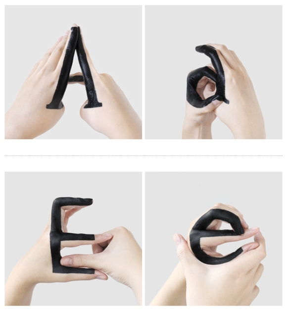
It’s a gorgeous, sunny Typeface Tuesday here in the District.
Overall, I like experimental design. I like it because I enjoy the rule breaking that can happen with unique and innovative designs. I also like the newness — or new perspective — of the work. You have to remember that it’s important to know the rules of design before you strategically break them. And certainly don’t break them for the sake of being a rebel (I’m afraid I’ve done this before — duh, I’m a Scorpio and need to test the boundaries). Do it because it works.
On my journey to learn more about typefaces, I’ve done some research on deconstructed type or using the forms of letters to create new shapes and meaning. I stumbled upon this fictional project by the International Society of Typographic Designers on Behance.com. The project involved creating a fictional typographic museum called Type Factory.
To make it fun and different, the designers blocked out some of the type in the logo. Interesting fact — did you know that one can read text when the bottom half is cut off? This has to be done carefully but as long as you can see enough of the letters you are good to go. In these designs the designers successfully cut off some of the bottoms and some of the tops of the letters while keeping others whole, so it reads well and is more dynamic/exciting for the eye. Plus, it gives you more negative space which is always a plus and far too rare — even in my own work! What is also neat about deconstructed type is that it causes you to more closely examine the letterforms, which translates well for this museum’s brand.
Go here to view the whole project.


As for general type guidance, remain in good standing with the Type Gods (and every good designer you know) by not commiting these crimes: http://www.itcfonts.com/Ulc/4111/TopTenTypeCrimes.htm


