Category Archives: Art I Love

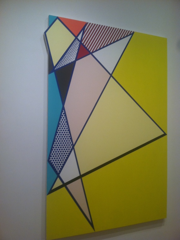
Art inspired by art through the eyes of Lichtenstein

Did you know that Roy Lichtenstein’s Look Mickey was the first pop painting?

Art critics deem that he knew he was onto something with this style painting and was inferring “hey, look at me.” Well, he had good instincts because he was onto something, and eventually became one of the most important American pop artists of our time.

Lichtenstein’s work was inspired by not only comic strips, but also 1950s and 1960s advertisements and the work of other famous artists at the time, such as Henry Matisse and others. His work is best known for the half-tone dots found in commercial advertising, which he reproduced, very meticulously, by hand. He celebrated the intersection of commercial art and fine art. It’s very impressive to see it in person; now that I have a better understanding his point of view as an artist and have seen his masterpieces in person, I am huge fan of his work. My favorite piece is the glass with Alka-Seltzer, shown below, which was done by pencil because to me represents the core of Lichtenstein’s work, his brand so to speak. I adore how he even included the effervescence effect at the top of the glass by erasing some of the dots.

He used a lot of humor in his work and often did a parody of whichever work he was inspired by. He began his career using a striped down palette where he replicated many everyday objects (magnifying glass, hot dog, radio) using his own simplified visual language. Meaning there was a particular visual code for which he would represent real-like elements, such as reflection, light, shadow, or movement. In the beginning he also dabbled with a little bit of Abstract Expressionism, which wasn’t his big focus by came in and out throughout his career. At the height of his career, he painted distressed, overly dramatic women and young men at war using a more evolved color-palette, his half-tone technique, and even painted type. Not long after, he became more abstract again and replicated paint brush strokes in his particular style and then moved into landscapes often filled with half-tone dots and playing with different materials such as metal. Later, he did some cubist-like paintings, dabbled in sculpture, created a series of abstract line paintings and a beach series, and lastly produced more landscape work this time mimicking asian landscape paintings. I appreciate how Lichtenstein shares with the viewer his take or response to the subject at hand allowing for a dose of humor here and there, and I am utterly impressed by his execution which often appeared as though it was created by a machine rather than by hand. His work is utterly captivating and make an enormous impact on Pop Art movement.

The Lichtenstein retrospective is currently being exhibited at the Art Institute of Chicago. In addition, as a part of BIGART 2012 in Chicago, you can spot some–160 in fact!–of Roy’s sculptures throughout the city. BIGART celebrates art by showcasing works from international renowned artists in public outdoor places so they are available for all to enjoy.

Tagged , , ,

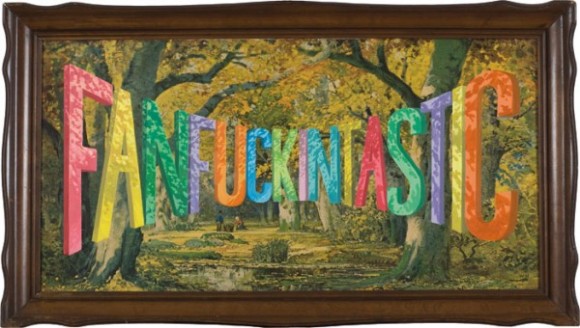
Typeface Tuesdays: Wayne White is Fanfuckingtastic with Type

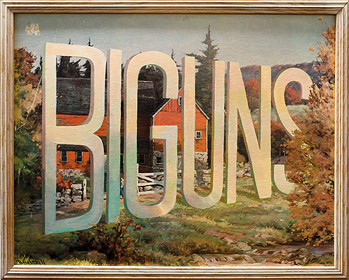
What do lithographs and funky 3-D type have in common?

Wayne White.

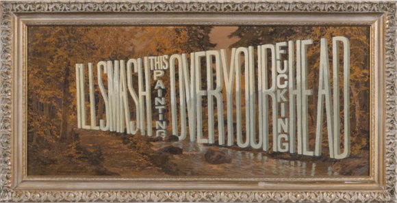
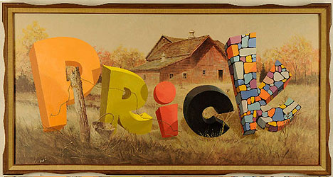
Yes, this artist in the later portion of his career found a way to tactfully combine the two, and the outcome is pretty wild, surreal, and funny at times.

Originally I thought he created the entire piece of art, but then learned that he buys the lithographs from thrift stores and then painstakingly overlays the type with paint. All of his work is impressive, but I do find some of his distorted type to be pretty fascinating and darn incredible (mastering the letterforms and their shadows as they are all turned and twisted is no joke)!

What a nice, colorful way to say what’s really on your mind…

Tagged , , ,

Cindy Sherman: The Ultimate Chameleon

It’s safe to say I am obsessed with the work of Cindy Sherman. She is truly talented and I really respect the career she has built over the past 35 years. Her creativity and imagination astounds me. I saw her retrospective at the Museum of Modern Art (MOMA) this weekend and although it was a little sparser than I expected, I enjoyed the MOMA’s display of her work. According to a New York Times article, the MOMA rightly described her work as “the unchallenged cornerstone of postmodern photography.”

I’ve always had a thing for playing dress up and make believe…and Cindy has made a living killing doing just that and then photographing herself often perfectly capturing the emotion and personality of the subject. You immediately want to know the story behind the subject at hand…what’s behind that fierce grin or those longing eyes? I don’t even know how Cindy comes up with all of the different personas she becomes, but besides that she executes just as impressively…they are so super believable. Something I learned this weekend is that she shoots everything in her studio where she projects different backgrounds (cityscapes, courtyards, office buildings, etc.). It was also cool to learn more about the progression of her work. She first became famous decades ago for doing a series of black and white portraits. Then she got into the heavy-duty costumes in which she has mocked the PR moguls and actress wanna-bes, she has glorified the victimized androgynous types, she has taken the viewer back in time by recounting many historical moments while also poking fun, she has even shown us her perverted side and apparent preoccupation with clowns. I don’t show any of the later two because, well, neither are really my thang.

The MOMA exhibit ends in May, so go see it now!

Tagged , , ,

Digging Daniela Edburg’s creepy humor

So, a funny little factoid is I don’t get creeped out easily. I don’t mind thinking about morbid things, and bugs and blood don’t really gross me out. I do have a limit, however, and could barely handle the scene in Drive where Ryan Gosling crushes the guy’s skull on the elevator…I think it was the sound that really got me.

Anyhoo, I say all of this because I really dig the work of surrealist Mexican artist, Daniela Edburg, and her stuff is definitely creeeeepy but also so clever and often very funny. I was recently introduced to her work and couldn’t get enough. This woman has a serious imagination, a terrific eye, and some majorly BADASS Photoshop skills. I would give anything to work Photoshop like she does! What I’ve gathered is that Daniela’s main motif is taking everyday situation or everyday people (often domestic goddesses) and putting a distributing twist to it. Take for instance an atomic bomb as the backdrop for a nice, friendly family picnic. Check out the atomic symbol on the cake…

The conceptual aspect of her work reminds me of the brilliant…and equally (or more) disturbed…Cindy Sherman, whose retrospective at the MOMA I am looking forward to seeing in the next 2 weeks.

And, last but not least, one of my personal favorites–“Death By Chocolate”–what a way to go

Tagged , ,

With the Hirshhorn’s latest installation, DC is becoming quite the arts town

Recently, on a late night run with my good friend, I stumbled upon the most magical thing.

We were running across the National Mall towards the US Capitol, surrounded by magnificent monuments and museums from all angles (a very DC moment indeed). We caught a murmur of music and a stream of lights, and we ran faster towards it, eager to discover what is was all about. My curiosity kicked into high gear, and as we got closer it started to come alive.

We ended up in front of the Hirshhorn Museum, DC’s modern museum of art and in recent years one of my favorites. What was different about the museum that night was its cylinder structure was draped in a video which incorporated many different takes of the song “I only have eyes from you” by the Flamingos. It felt almost like a series of short music videos from the perspectives of various artists/individuals. We watched it in awe for a while, and then continued on our run, but I couldn’t help but feel this continuous buzz of excitement inside of me. It is truly fascinating to experience an installation of that size where the structure is the canvas. This interactive installation delights multiple senses at once, and it can never be experienced the same way more than once, making it truly dynamic and captivating.

Upon later research, and another visit back, I discovered that this art piece is a short-term installation by Doug Aitken, an American artist based in New York. Called SONG 1, Aitken’s installation at the Hirshhorn is among his many commissions known as “liquid architecture” where he transforms a building into a piece of art that is influenced by its structure and surrounding environment.

Song 1 is only in town for 8-weeks, which is now down to 7…so make sure to check it out stat and preferably at night for the full effect. I get chills just thinking about it.

Tagged , , , ,

Art Basel 2011

I’m back in my beloved Miami for a long weekend, and it just struck me that I never posted about my visit in December….

It was my first time at Art Basel and what I quickly realized is that there is a ridiculous amount to do and simply not enough time. There are art events galore and now a ton of great street art and music events in the Wynwood art district. We only scratched the surface and still managed to sleep very little. Best party was HolyGhost! at Bardot…didn’t stop dancing…

Here are some pics of the most interesting, striking, and downright bizarre art works from Art Miami and Design Miami.

B & me

A great Warhol…

It’s made out of raisins…ha!

WOW, talk about meticulous

Downright creepy but at the same time kind of sweet and cuddly

These maps are all thread and beading

It’s electric! Literally. The new wave of art meets technology

This series is made of entirely electrical wires, how wild

Next to his mobiles, this is a great Calder piece

Love the texture of these. Oh, and you wouldn’t believe how much they go for!

A table made of yellow leather

I want this record player

xoxo

Tagged , , ,

Nothing says happy holidays like a blinging skull

Merry Christmas Eve, all. The last two weeks have been a blur finishing up things for work before heading out for the holidays…hence no blog posts…will have to add this one to my list of new years resolutions.

Interestingly, in the past week or so multiple people have mentioned Damien Hirst’s diamond encrusted skull titled “For the Love of God.” For some reason I’ve never heard of it before. This is a piece he developed a few years ago, which became famous and sold at auction for millions. Could you imagine if your skull was turned into famous artwork? How clever and kind of creepy!

Getting in the mood

In T minus ~21 hours I will be in Miami LIVING IT UP and SOAKING UP art, music, and the beach lifestyle. In honor of Art Basel, I am sharing some art I experienced at DC’s Uncapped Live art event hosted by Art Whino and BYT earlier this year…which I totally dug! Those little vinyl dudes are outrageous. Art Whino will be doing their thing at Basel this year, in addition to a plethora of other exhibits and events.

I promise to take lots of pictures and report back.

Tagged , ,

Typeface Tuesdays: Light Writing

A little type talk for you as a turkey-filled day looms in the near future.

On the train up to my Thanksgiving destination — New York — I finished up a design book, Graphic Design Thinking: Beyond Brainstorming. I’ve been on a mission to get more inspired, and this book has been one component of my mission to think about how to approach projects in terms of defining a problem, getting ideas, and creating form with a fresh perspective. This book really hit all of the high notes for me, and I learned a lot in terms of employing visual brain dumping, applying action verbs to concepts, sprinting (putting pencil to paper in a timed fashion), using a kit of parts, and more. It was also nice to view the work of other talented artists for continued inspiration. To supplement this, I attended an AIGA DC lecture on inspiration called When Lighting Strikes and have been trying to sketch more.

One of the book’s case studies on Art Everyday, an organization with the mission to make arts an integral part of education in all Baltimore city schools, used a type technique in their promotional posters that caught my eye. Light writing (aka “light drawing”). I know I’ve seen it before but didn’t know what it was called or how it was constructed. Well, according my online research “the most common technique [of light writing] is to capture multiple second exposures of light moving from one point to another in the frame. Though the technique was employed almost one hundred years ago by Pablo Picasso it has only recently been used for main stream advertisements.” What’s especially fitting about using light writing for Art Everyday is shows art in action, which helps people understand arts integration — and why it’s important.

Below are some light writing/drawing sample images — including one from Picasso, one of the most talented and versatile artists of all time


Tagged , , ,

Typeface Tuesdays (uhem… late again): Letterpress printing by Globe

I decided to opt for quality over timeliness for this post. I wanted to come up with an engaging topic, so it required a little extra digging.

I’m going to take you back… back to 1929. This is the year Globe Poster Printing came into business…and their story is an interesting one. Their business began over a poker game in Philly. Below is an excerpt of their story from the Globe site….

“At the [poker] table, Norman Goldstein, a wealthy New Yorker and Harry Shapiro, a Philadelphia printer, decided to go into business together.  To settle on a location for their company, they took a map of the East Coast, folded it and opened it up.  The crease was on Baltimore, so that’s where they started.  At that time, Globe printed posters for vaudeville acts, movie theatres, burlesque houses, and carnivals.”

Can you imagine? From the stories I’ve heard, many great business ideas sprout during everyday moments. I happen to love the charms of this particular anecdote.

So, fast forward to May of this year when Maryland Institute College of Art (MICA) in Baltimore, MD announced its acquisition of approximately 75 percent of the historic Globe Poster Company’s letterpress printing collection to include wood type, images, and illustrations. MICA has been using the newly acquired letterpress as academic and research resources, giving budding artists and designers the opportunity to learn first-hand traditional printing practices while also discovering modern methods via today’s digital tools. It’s fascinating when you think about how the letterpress letters have out lived the hands that designed them back in the 1930s; they are durable to say the least. Today’s modern typefaces mimic those of the original letterpress.


Tagged , , , , , ,