Skolos + Wedell: Collaging Process

Yesterday, on a whim I decided to participate in a terrific workshop with Nancy Skolos and Thomas Wedell. I say on a “whim” because I am really trying to cut back on the extra commitments I make in the new year but last-minute said to myself what the heck I’m doing it. Let’s be honest, I make rules so I can break them.

I’m glad I went with my gut because it turned out to be 100% worth it. The pair, who are married and run a design studio together called Skolos + Wedell (really love that she comes first in the company name), are one of those dream, power design couples. Kind of like Ellen Lupton and Abbott Miller. Or Jessica Hische and Russ Maschmeyer.

Nancy and Tom both attended Cranbrook Academy of Art, which you can see in their shared aesthetic. When the workshop started up my first reaction–OK, second because my first was that they are a talented duo–was these two are funny and playful. They have a great dynamic together, they laugh a lot, and they see the value in breaking design rules. The workshop consisted of learning their process to “break the ice” when you’re encountering a new design challenge–a method to remedy facing the dreaded BLANK CANVAS.

More specifically, it’s a collaging process that involves using 2- to 3-inch size pieces of paper cut from books and magazines (and maybe even previous design drafts). The paper must consist of only angular lines in order to effectively line them up to create new structure by making interesting relationships with the slivers of photos, drawings, and typography. After taping together several collages to 8.5 x 11 inch white paper, use a cropper to frame your design (you can get more than one layouts from a single collage). Then, grab some tracing paper and draw out the shapes you like. Next, you have to edit back so it will work for the purpose of your design. Finally, you bring the layout into the computer to guide designing your final work. This visual structural format doesn’t apply well to all design projects but does with mediums like posters and book covers.

The main concept is to “go to structure to get your mind fluid; then think about the content in a structured way” according to Tom. He and Nancy encouraged us to not think too hard, forget the formal rules we usually abide by, and just feel it. I love being intuitive and definitely gained another set of tools to add to my toolbox.

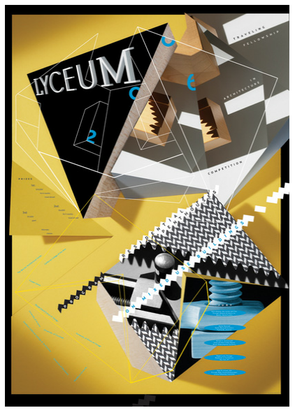
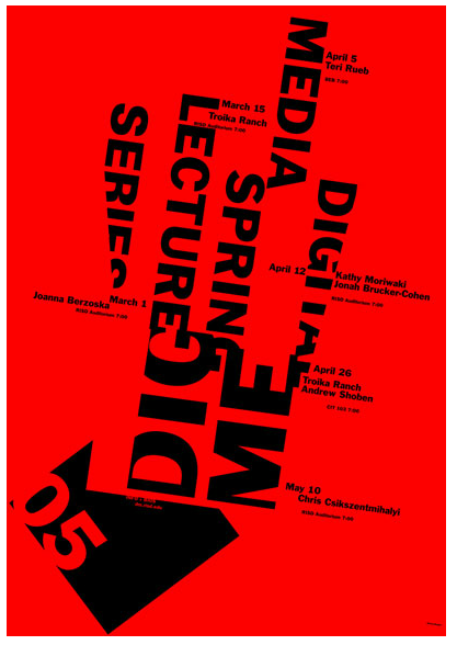
You can see the results of this process in a sampling of their posters below. Look at the dynamic relationships in their work like how image and type overlap, as well as the complexity of the overall composition. Browse through the entirety of their published work on skolos-wedell.com.
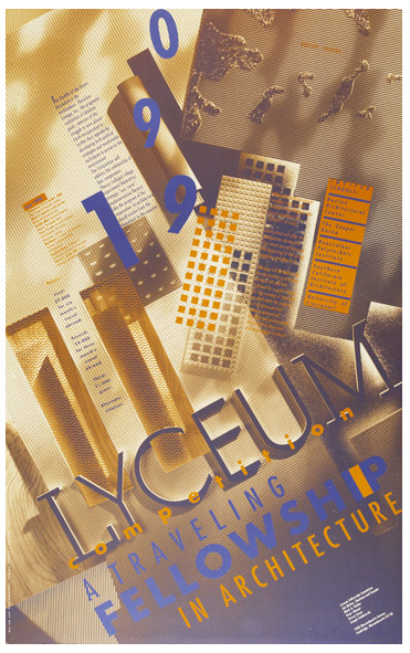
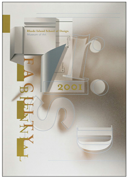
Skolos-Wedell Poster Lyceum

Skolos-Wedell Poster RISDSkolos Wedell Poster Lyceum FellowshipSkolos and Wedell Poster Social Media

Tagged , , , ,

Typeface Tuesdays: Dear Jessica

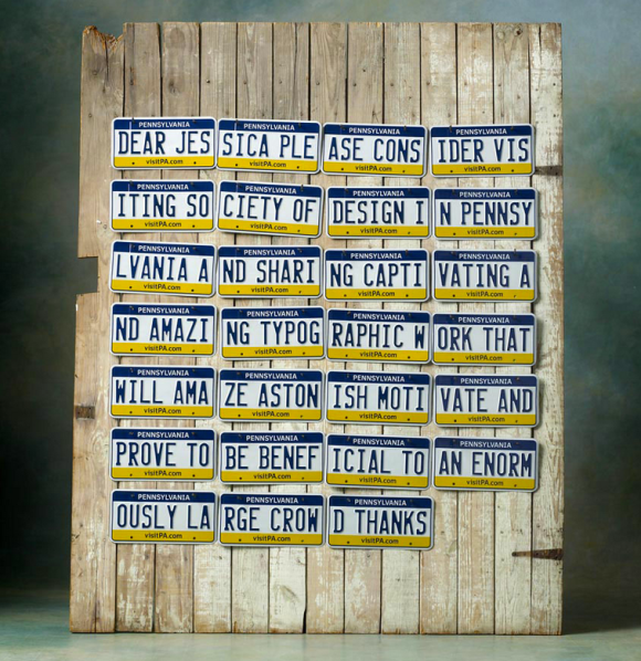
The Society of Design went to great lengths to invite the lovely Jessica Hische to speak at their facility this spring. It consists of 27 registered Pennsylvania license plates assembled together to reveal a message and publicly released on InvitingHische.com. I’m not sure what the significance of license plates other than their permanence. The society wanted to show Jessica they were seriously committed…and like driving? Interestingly because of the medium chosen, the gestalt of this piece has a very different meaning than the individual parts. Without every single license plate gathered together this piece of artwork would not have a clear message and complete feel.
Society of Design - Dear Jessica

You, too, can see Jessica speak at the Society of Design. Check out more information here.


Typeface Tuesdays: Anticipating spring

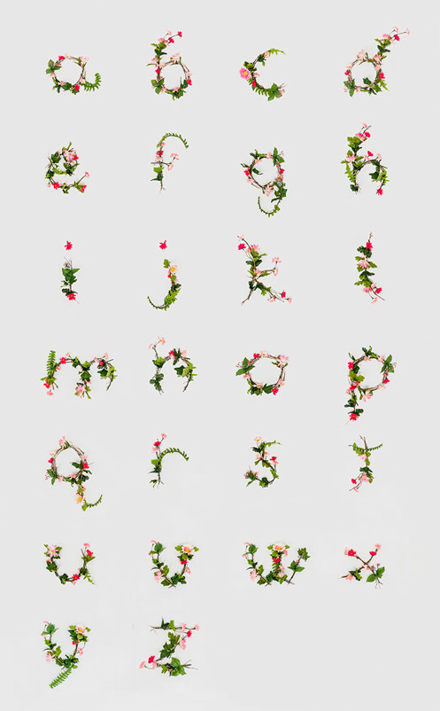
Welcome to the first Typeface Tuesdays post of the new year. Due to my anticipation of spring (and much warmer days) and in honor of the first day of the spring semester at MICA, I am featuring a floral type design by a undergraduate classmate, Anne Lee. These letters are pretty and uplifting.

Floral type by Anne Lee

To see more of Anne’s work, visit her site. In the meantime, buddle up!

Tagged ,

Hello twenty thirteen

I’m baaack. This past Christmas break felt more deserved than ever before. My first semester at MICA revealed a daunting reality to me: making art is hard. And, the practice of art making takes so much time and repetition to get it just right…but even then it’s always subject to change because it’s art and it’s never really done. But now that I’m over the hump of my initial exposure to art school, I want to make sure I keep up with my blog. I love writing and sharing my observations, inspirations, and opinions with others…and there’s so much to share while you’re immersed in an academic environment.

One of my “designer moments” during the fall semester was when I was able to pinpoint the particular aesthetic style of my work. I like designs that are very graphic and colorful that are rich in typographic form. This style is reflected in much of the Dutch design work of the late twentieth century through today. Thanks to my new Meggs’ History of Graphic Design book, I’ve enjoyed learning about the Dutch culture and history and the ways in which it has influenced their overall approach to design. I can particularly relate to this line from the book: “Dutch citizens prize their individuality and free expression and extend this freedom to others, creating a social climate that encourages innovation.” An example of this approach is Studio Dumbar, a rad little brand identity design company based in Rotterdam in South Holland, as well as in Shanghai, China and Seoul, Korea. Founded by Gert Dumbar who got his training from London’s Royal College of Art, Studio Dumbar prizes itself on encouraging individual expression and diverse techniques. It’s a culture that fosters intuition and humor. By the 1980s, many other designers were mimicking the studio’s design style.

Below is a taste of what they make…

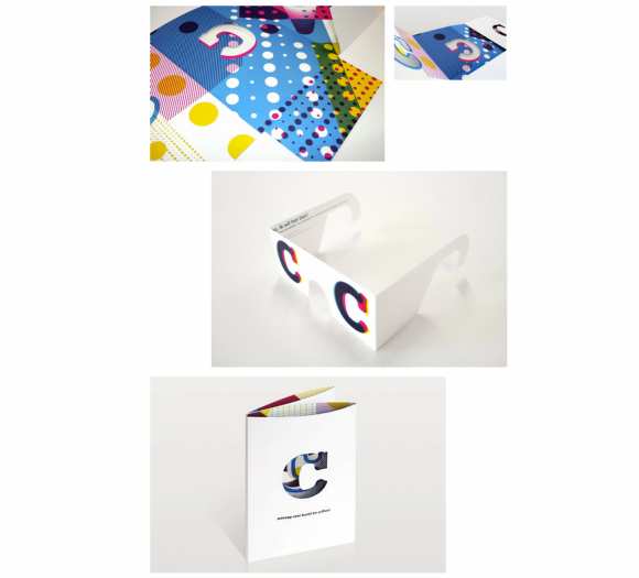
This is an integrated branding campaign for C Broadcasting in which Studio Dumbar devised a system of dots and the letter ‘C’ as a brand identity. I really enjoy that the ‘C’ can appear in different variations of the CMYK color palette and dotted texture and still appear as one recognizable brand system. Truly clever, and I want a pair of those glasses!

Studio Dumbar C Broadcasting

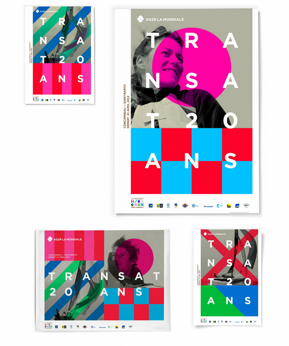
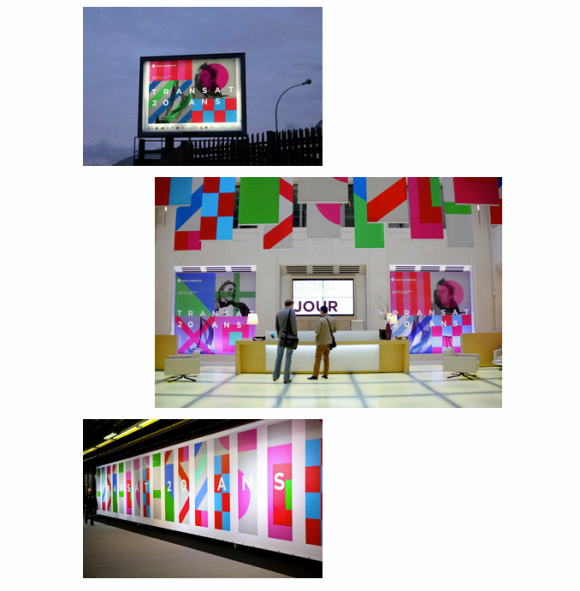
This campaign is especially interesting because you’d never guess what it’s for. It’s a new brand for a French insurance company merger. Wild, right?! I love it because the simple application of geometric shapes creates such an interesting pattern. It feels so fresh and exciting. They did a great job applying the design to many communications platforms…visit the website to see the full campaign and learn more.

Studio Dumbar AG2R LA MONDIALE LE TRANSAT

Studio Dumbar AG2R LA MONDIALE LE TRANSAT 2

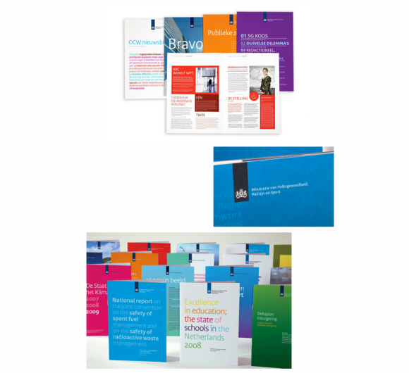
Lastly, I wanted to share some of Studio Dumbar’s work for the government because their designs for the Dutch postal service (former called the Royal Dutch PPT and now TPGPOST) influenced the beginning of a widespread shift in more expressive design in the public space. I couldn’t find the actual TPGPOST designs but below are comparable designs for the Dutch Government, which you can explore more here.

Studio Dumbar Dutch Government

Typeface Tuesdays: Handmade Type

I love this! How creative and thoughtful.

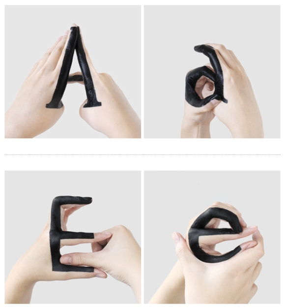
It’s a typography experiment by a designer in New York City named  . She took it up herself to play around with the relationship, more specifically the transition, between uppercase and lowercase letters by painting her hands with black ink and changing her gestures to make the letterforms. It’s a fun and interesting way to study different elements of the letterforms.

Here’s a glimpse at what she’s created.

I definitely recommend you go to Tien-Min’s website to see the project in its entirety, including a video where the letterforms come to life.

Tagged ,

Art inspired by art through the eyes of Lichtenstein

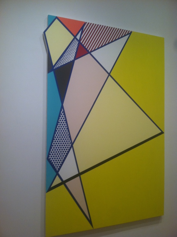
Did you know that Roy Lichtenstein’s Look Mickey was the first pop painting?

Art critics deem that he knew he was onto something with this style painting and was inferring “hey, look at me.” Well, he had good instincts because he was onto something, and eventually became one of the most important American pop artists of our time.

Lichtenstein’s work was inspired by not only comic strips, but also 1950s and 1960s advertisements and the work of other famous artists at the time, such as Henry Matisse and others. His work is best known for the half-tone dots found in commercial advertising, which he reproduced, very meticulously, by hand. He celebrated the intersection of commercial art and fine art. It’s very impressive to see it in person; now that I have a better understanding his point of view as an artist and have seen his masterpieces in person, I am huge fan of his work. My favorite piece is the glass with Alka-Seltzer, shown below, which was done by pencil because to me represents the core of Lichtenstein’s work, his brand so to speak. I adore how he even included the effervescence effect at the top of the glass by erasing some of the dots.

He used a lot of humor in his work and often did a parody of whichever work he was inspired by. He began his career using a striped down palette where he replicated many everyday objects (magnifying glass, hot dog, radio) using his own simplified visual language. Meaning there was a particular visual code for which he would represent real-like elements, such as reflection, light, shadow, or movement. In the beginning he also dabbled with a little bit of Abstract Expressionism, which wasn’t his big focus by came in and out throughout his career. At the height of his career, he painted distressed, overly dramatic women and young men at war using a more evolved color-palette, his half-tone technique, and even painted type. Not long after, he became more abstract again and replicated paint brush strokes in his particular style and then moved into landscapes often filled with half-tone dots and playing with different materials such as metal. Later, he did some cubist-like paintings, dabbled in sculpture, created a series of abstract line paintings and a beach series, and lastly produced more landscape work this time mimicking asian landscape paintings. I appreciate how Lichtenstein shares with the viewer his take or response to the subject at hand allowing for a dose of humor here and there, and I am utterly impressed by his execution which often appeared as though it was created by a machine rather than by hand. His work is utterly captivating and make an enormous impact on Pop Art movement.

The Lichtenstein retrospective is currently being exhibited at the Art Institute of Chicago. In addition, as a part of BIGART 2012 in Chicago, you can spot some–160 in fact!–of Roy’s sculptures throughout the city. BIGART celebrates art by showcasing works from international renowned artists in public outdoor places so they are available for all to enjoy.

Tagged , , ,

In awe of Chicago’s architecture

I must have really been stuck in my east coast bubble because I feel like I’m just now realizing how much a midwestern city like Chicago has to offer. The windy city rocks. Granted, I am here during the summer so that changes the game a bit.

Here’s a brief run down of what make this city wonderful…

  • It’s laid-back and friendly.
  • It’s diverse in its people and activities to do/trouble to get into.
  • Cute dogs are bountiful. I dig these little guys in all shapes and sizes…far more than children at this point.
  • It’s by the water, which offers not only its nautical beauty but also helps energize the city with the sea air. I ran along it today and swear everyday should now start with a run by Navy Pier.
  • It’s a very aesthetically pleasing city on many levels. Art is highly appreciated, and plentiful both in public areas and those that are museum- or gallery-based, and even the street banners, pamphlets, and restaurants around town are well-designed. The architecture is to die for.
  • It caters to one of my favorite hobbies…EATING. Great food. Two nights ago I ate at GT Fish and Oyster (even their website design is rad) and seriously considered licking my plate clean. I ate at Big Star last night and it was damn good (their chips are seasoned with lime juice making them uniquely tasty).
  • It caters to my career interests with all of the marketing and advertising companies.

On my travels before school starts, I am doing my very best to live in the moment, be observant, and take in all inspirations around me. As a part of that journey, my boyfriend shared with me that it’s important to be in awe. In fact, it’s good for your well-being. Turns out, I am awestruck by this city’s magnificent buildings which I got a close at during a architectural boat cruise (definitely recommend–I learned a lot and our charming tour guide even ended the trip with a harmonica tune inspired by Chicago).

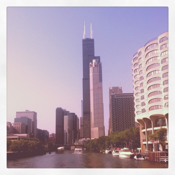
First, I am in pure amazement of the sheer height and complexity of these structures. Coming from a city like DC where buildings are usually no higher than 10 stories this totally fascinates to me. It’s not like I haven’t seen a skyscraper before with all my visits to New York but since Chicago is more spread out and flat the height appears more extreme. Plus, the Sears building is gigantic (see below)! Additionally, I appreciate the diversity in styles including art deco, art modern, post-modern, and so on, which draw from various movements across the world but mostly Europe. I was blown away by several buildings: Aqua skyscraper for its organically shaped balconies (each is slightly different and it is the tallest building to be built by a female architect), River City which is Gaudi inspired (a brilliant designer and one of my favorite architects), Marina City looks like two honey cones, Lake Point Tower is an amazing circular shape inspired by Bauhaus movement and when the light hits it almost glows, and the NBC Tower is a classic art deco style and really gorgeous.

More to come on my adventures.

Tagged ,

And, we meet again

Oh hi. Looky here, I didn’t drop off the face of the earth…

I encountered an unplanned blogging hiatus aka I quit the Internet for a bit just as I hit the “refresh button” on my life so to speak. After 5 years doing consulting, I quit before going back to school at Maryland Institute College of Art (MICA) for graphic design this fall!!!!!!!! And let me tell you, free time is a blessing because I’ve finally gotten a chance to really relax and really play (and read for pleasure–what a novel concept), while also being truly immersed in the summer time happenings of DC both solo and with many loved ones. But I miss blogging, WordPressing, Googling, and spending endless hours of my idle time online. So, here we meet again.

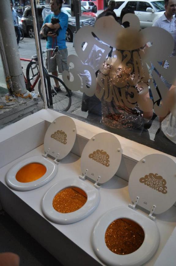
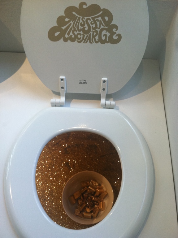
Last Friday, my friend and mentor Shawn Moriarty invited me to his exhibition “Mass Fad Discharge” at the Transformer Gallery in DC. As a part of the Emerging Artists program, Shawn and two other artists–Christie Liberatore and Noelle Weber used humor (some potty, some not) and lots of GLITTERY GOLD to mock popular trends seen in modern day design that are, well, crap. The exhibition logo seen below on the window and toilet lids which is part of Christie’s design, is in the shape of a blob of poop. Very pretty poop might I add, which was designed by Noelle. And if you were to reach your hand into the toilet (duh, I did) you can score some chocolate wrapped in gold!

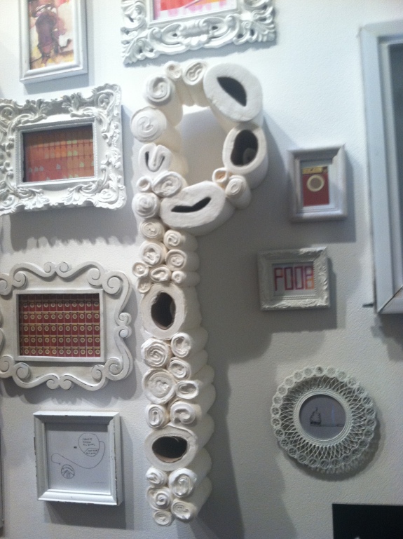
Besides the toilets, Noelle designed an entire wall of messages some done by hand and toilet paper and others using the computer and complete with shabby chic frames. Together the various elements tell a complete story about the her take on over done design fads of today.

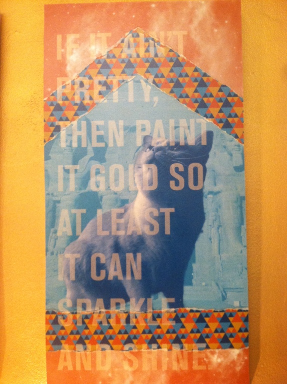
Shawn’s work spanned the other wall from floor to ceiling. He started with a canvas of gold paint on the wall and adorned it with a series of three portraits of his cat in a collage motif. The work continued to your feet where there was glittery gold sand, a pooped scooper, The piece was intended to look monumental with the heights in which they are placed on the wall and the lights shining up on them.

Overall, I dug the various approaches and materials the three artist took to communicate the same message. For more pictures of Mass Fad Discharge, visit the Transformer Facebook page, and if you’re in the neighborhood pop in to see it before it ends on August 18th.

Tagged , ,

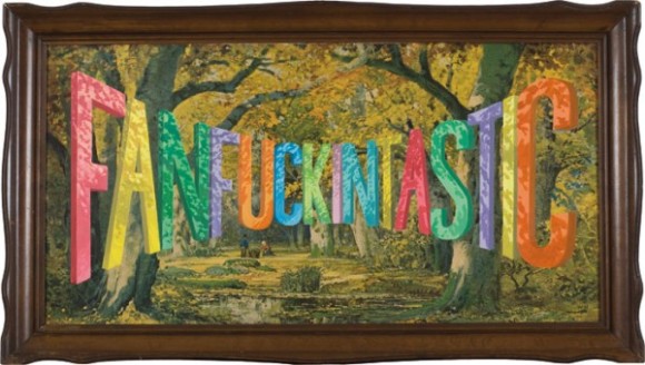
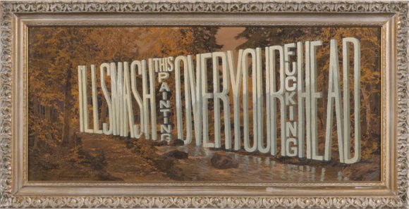
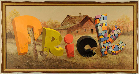
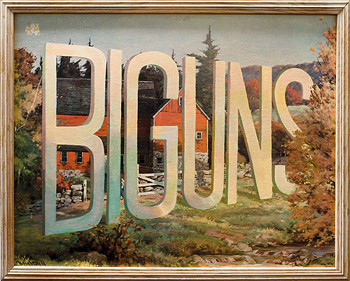
Typeface Tuesdays: Wayne White is Fanfuckingtastic with Type

What do lithographs and funky 3-D type have in common?

Wayne White.

Yes, this artist in the later portion of his career found a way to tactfully combine the two, and the outcome is pretty wild, surreal, and funny at times.

Originally I thought he created the entire piece of art, but then learned that he buys the lithographs from thrift stores and then painstakingly overlays the type with paint. All of his work is impressive, but I do find some of his distorted type to be pretty fascinating and darn incredible (mastering the letterforms and their shadows as they are all turned and twisted is no joke)!

What a nice, colorful way to say what’s really on your mind…

Tagged , , ,

Typeface Tuesdays: Stephen Powers

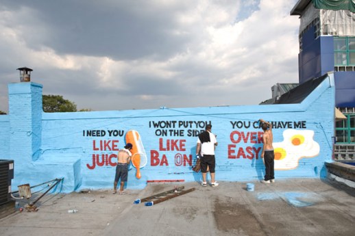
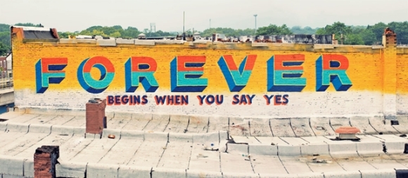
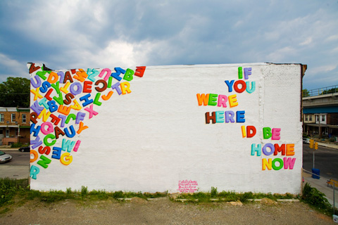
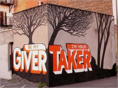
Feel the power of Stephen Powers (aka ESPO). I personally dig this designer for several reasons…

He is a talented type designer.

He creates big, colorful street murals with a dash of humor of a big dose of love.

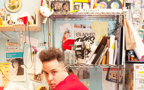
He has unruly Kramer-like hair, and what’s not to love about that?!!

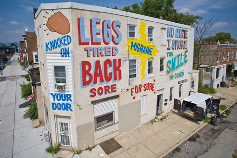
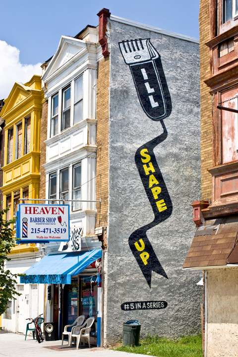
A few years ago, Powers team up with the city of Philadelphia to execute a special project which consisted of dozens of love-themed typographic murals throughout the city. It was appropriately named “Love Letter” and you can check out some of the murals below…

Tagged , , ,